Rest, Australian Superannuation made simple
KPMG Creates collaborated with Rest Superannuation to reimagine its visual brand identity and app, fostering a stronger connection between members and their financial future. The refreshed design strikes a balance between boldness and simplicity, improving accessibility and clarity across every touchpoint. By employing a modular approach, complex information is transformed into clear, engaging formats, empowering members to confidently navigate their super. The result is a sophisticated, contemporary brand experience that resonates with Rest’s 2 million members and drives meaningful engagement.
Client
Rest Super
Agency
KPMG Creates
What was delivered
Brand ID
App/Product Design
Design Team
Andrea Schlaffer, Tim Haynes

Brand strategy
“Rest is on a journey to make super simple.”
The Super Simple strategy emphasises the importance of designing Rest’s future with young people at the centre. By prioritising their needs, we not only maximise our potential to positively impact their lives but also create a brand that is resilient and built to thrive in the future.
Purpose
Create super our members love
Mission
Make super simple
Focus
Start with the young
Be effortless
Stand for value
Brand territory
Uniquely simple
Brand benefits
Functional benefit
We make super simple for our members to understand and take action early.
Emotional benefit
We create “Aha” moments that make our members feel accomplished and understand the value of super.
Brand values
Simple
Our members have diverse backgrounds and their lives can be complicated, so we ensure every interaction is as simple as can be.
Proactive
We arm our members with the right info at the right time to make the right choices.
Relentless
We strive to go above and beyond to better and improve our members’ futures, regardless of the work they do.
Tone
Upbeat
We’re upbeat because there’s lots to be upbeat about. When super’s this easy, action is easy. And when action is easy, our members are unstoppable. And this makes us happy.
Confident
They say confidence breads confidence. So we talk about super in a confident way. Which means our members have confidence in us, and their future.
Distinctive
We’re distinctive because we embrace what sets us apart. We talk about super authentically, truly standing out in a sea of uniform super funds.
The typography that embodies the elegance of diversity
The Plus Jakarta Sans is a versatile modern type family designed for Plus Jakarta City Branding, where each glyph has its own varieties with its own different characteristics. Like the city itself, the beauty is in the details. The charms of Plus Jakarta Sans appear when one looks closer, manifesting in a beauty that emerges once seen as a whole. Each alternate on Display family contains several alternates characters, while the text version has a small adjustment to preserve the legibility of small sizes.
Influenced by timeless typefaces such as Neuzit Grotesk, Futura, and 1930s grotesque sans-serifs, Plus Jakarta Sans balances monolinear contrast with sharp, refined curves. Its slightly taller x-height creates harmonious spacing between uppercase and lowercase forms, while open counters and carefully balanced proportions ensure clarity across a variety of applications. This typeface seamlessly blends modern precision with understated elegance.

Brand colours
Green is a colour deeply associated with harmony, safety, growth, and financial prosperity—qualities that align with Rest’s commitment to helping members build a secure financial future. Darker shades of green, often linked to wealth, stability, and trust, reflect Rest’s dedication to financial growth and long-term security.
Meanwhile, lighter greens symbolise renewal, vitality, and a fresh approach to financial well-being. Psychologically, green evokes calmness and clarity, fostering trust and balanced decision-making—values that underpin Rest’s relationship with its members. Through the thoughtful use of green in its branding, Rest communicates a sense of stability, reliability, and a clear path to financial growth.

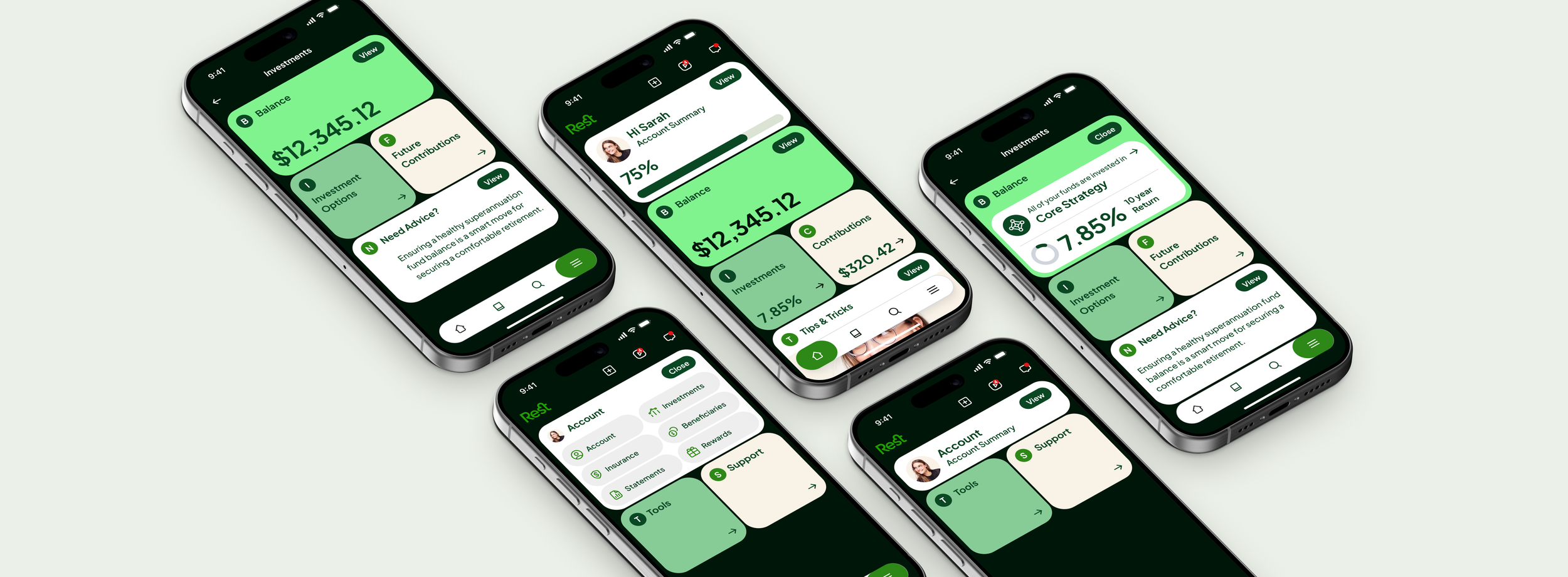
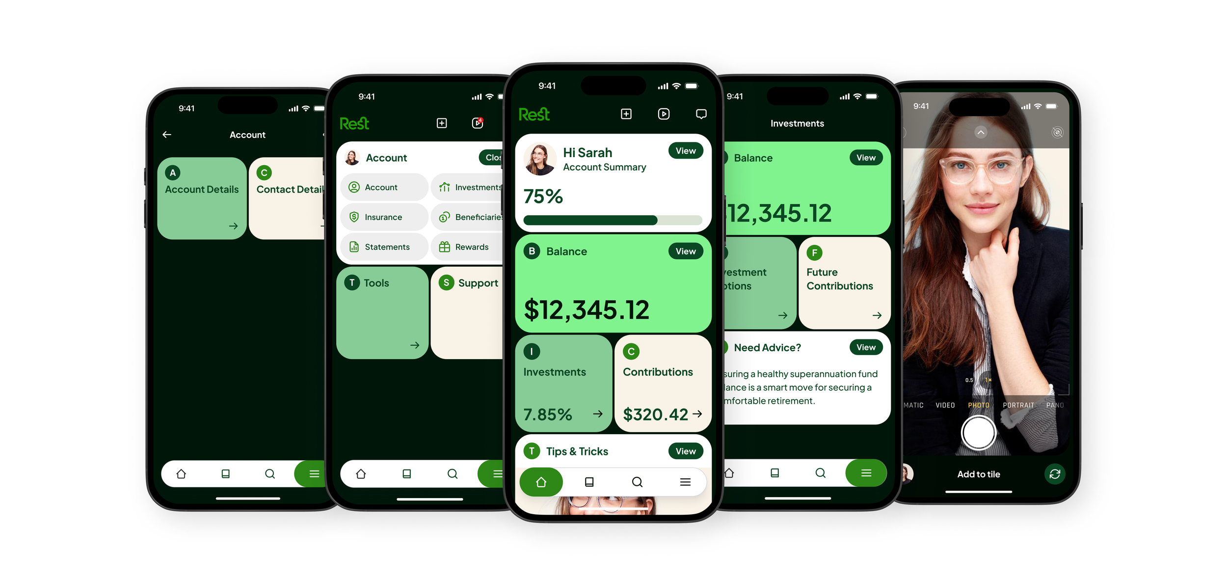
App system architecture
The Rest app uses a flexible tile system to present complex information in a clear and engaging way, helping members easily navigate their super. These tiles organise content like balance details, investments, contributions, guides, and next steps into clear, digestible sections. They also act as shortcuts for quick access to key actions or resources. Tiles come in three vertical sizes—full, half, and quarter—and can be arranged in pairs horizontally for a clean, user-friendly layout.

Light theme
Dark theme

Instagram post and reel layout

App modular system components
