The Eye on the Reef app
The Great Barrier Reef, one of Australia’s most extraordinary natural wonders, is home to the world’s largest coral reef system, vibrant marine life, and over 3,000 reefs and coral cays.
The Eye on the Reef app empowers users to contribute to the Reef’s preservation by offering offline access to interactive zoning maps and regulations, even beyond mobile coverage.
My goal was to improve overall UX/UI and administrative functionality & boost voluntary compliance with Marine Parks zoning regulations. Gather critical reef health data from users and establish a two-way communication channel between reef users and marine park managers. Provide educational content to enhance user knowledge and allow for future expansion and scalability.
Client
Great Barrier Reef Marine Park Authority
Agency
KPMG Creates
What was delivered
Discovery and research
IA and UX strategy
App design concept and protoypes
Design System
Project overview and concept goal
The Eye on the Reef app, operated by the Great Barrier Reef Marine Park Authority, enables citizens, tourists, and marine experts to report reef health and sightings. For this concept project, the design challenge was to explore how the app could be reimagined as a scalable, modular, and offline-capable experience that aligns with contemporary UX and service design standards.
Key concept objectives:
• Enhance accessibility and ease of use across diverse user groups.
• Design for remote, offline environments typical of reef locations.
• Support modular content to manage app performance and storage.
• Improve user engagement through social integration and personalisation.
Research and problem definition
Since this was a concept project, we gathered data from public sources including:
• GBRMPA and Eye on the Reef official documents.
• User reviews on app stores.
• Similar conservation/citizen science apps (iNaturalist, Marine Debris Tracker).
• Published reports on marine tech engagement and offline-first mobile UX.
Key insights included:
• Frequent frustration with offline functionality and delayed syncing.
• Users needed a clearer onboarding path.
• Limited device storage was a blocker for larger species libraries.
• The app could benefit from greater visual engagement and social shareability.
UX strategy and design approach
We defined our design principles around modularity, simplicity, and offline resilience. The experience needed to support both short-term tourists and long-term conservationists.
Key UX strategies included:
• A modular download system: users could install only what they needed—like species packs or location-based content—saving device space.
• Offline-first architecture: actions like saving sightings, geotagging, and uploading photos could be queued and synced automatically when signal returned.
• Quick entry design: streamlined the sighting submission process to work in under 30 seconds with essential info only.
• User segmentation: different dashboard views for tourists, citizen scientists, and marine professionals.
Key features
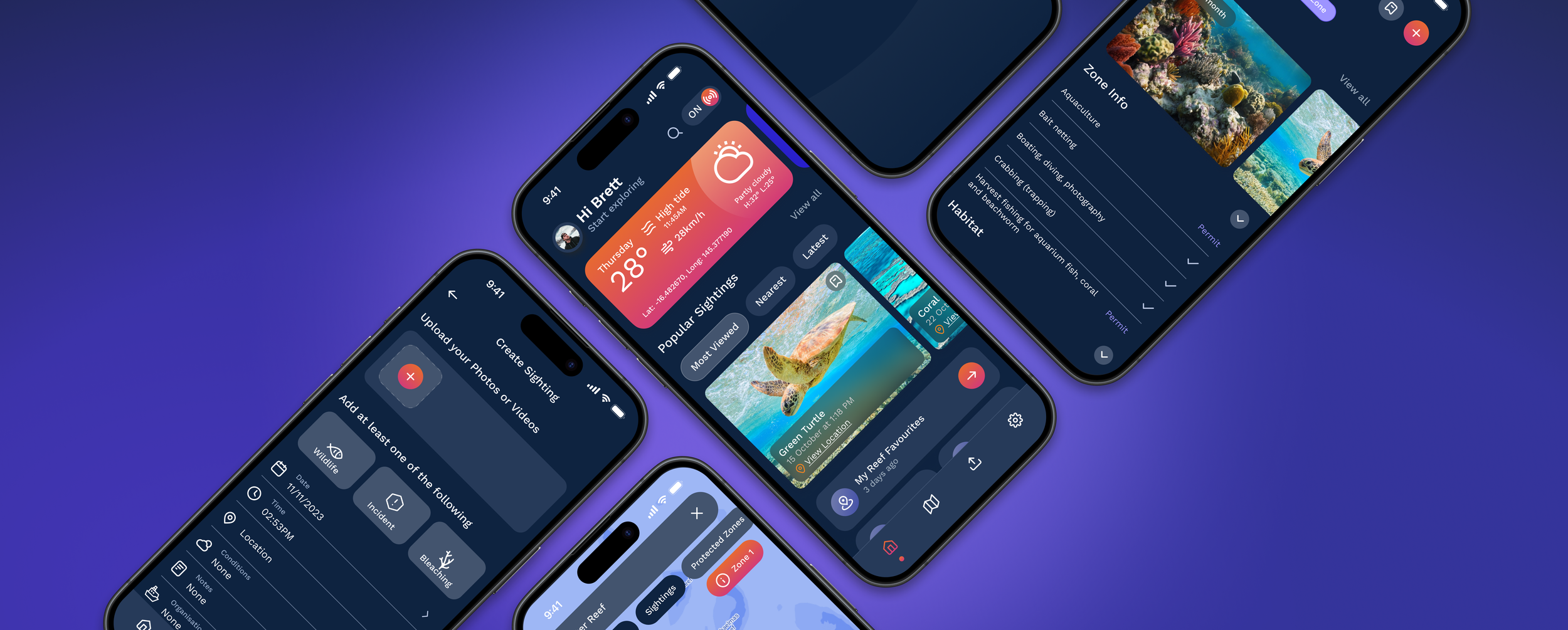
Key features include Popular Sightings, which highlights trending marine life and notable reef events through visually engaging cards and intuitive filters. My Reef Favourites allows users to save and easily revisit preferred locations, species, or past sightings. My Reef Itinerary offers interactive trip planning tools with timeline-based navigation and geo-tagged recommendations tailored to the user’s journey. The Reef Watch dashboard provides real-time updates on reef health, weather conditions, and conservation alerts. The Create Sightings feature guides users through documenting and sharing their discoveries with structured forms and photo uploads.
At the heart of the experience is a dynamic map interface, serving as the central hub for exploring points of interest, tracking location, and accessing contextual, location-specific data.
Additional core components of the concept included:
• A modular content library for flexible downloads (e.g., species packs, regional data).
• Customisable UI sections, allowing users to tailor their map views, personal logbook, and latest updates.


Design System
The comprehensive design system establishes a user-centric experience tailored for visitors, marine enthusiasts, and conservationists navigating the Great Barrier Reef. Built on a foundation of scalability and consistency, the system features a cohesive library of UI components, design patterns, and accessibility guidelines optimised for diverse environments. The design system also prioritises responsive layouts, scalable, custom iconography, and thoughtful micro-interactions, ensuring a frictionless experience across devices (mobile, tablet). Through this structured and visually cohesive design approach, the app also empowers users to actively contribute to the preservation of one of the world’s most extraordinary ecosystems.

Dark theme colour palette
The app designed with dark mode offers significant benefits for users exploring the reef under bright sunlight. The high contrast of light text and visuals against a dark background reduces glare and enhances screen readability, even in intense outdoor lighting conditions. This is particularly useful for displaying critical information like navigation maps, marine life identification guides, and weather updates without the screen being washed out by sunlight. Additionally, dark mode conserves battery life on OLED and AMOLED devices, allowing users to rely on their devices for longer periods during reef excursions. By minimising eye strain and improving visual clarity, dark mode ensures an enjoyable user experience while exploring the reef.

The anatomy of icons
The icon grid forms the structural basis for visual balance and scalability across various screen sizes and resolutions. Each icon adheres to a clear space guideline, maintaining defined padding around the graphic to avoid visual clutter. Stroke weight and corner radius are standardised to promote consistency and align with the app’s overall design language. Icons are organised by function—navigation, status indicators, and interactive elements—and are thoughtfully crafted with accessibility in mind. This structured approach strengthens visual harmony and supports user understanding, contributing to an intuitive in-app experience.