TAB, Australia's biggest multichannel wagering provider
TAB is Australia's biggest multichannel wagering brand, offering a broad range of betting experiences across digital channels and in retail throughout Victoria, New South Wales, Queensland, South Australia, Tasmania, Northern Territory and the ACT.
My role involved developing a comprehensive app design system, known as the Grass Design System, as part of a team of three Senior Product, Visual and UI Designers. And also leading the redesign of the existing TAB app to align with the new design standards. The goal was to enhance the overall user experience, streamline the betting journey, and support Tabcorp’s broader digital transformation strategy. This initiative was part of a larger effort to modernise TAB’s digital products and deliver a personalised experience to users.
Client
Tabcorp
Agency
KPMG Creates
What was delivered
Grass Design System
Product Design
App Design

User research and key findings
In collaboration with the research team, we conducted user interviews, surveys, and in-depth data analysis. We spoke with both regular and casual bettors to uncover their needs, behaviours, and pain points. Questionnaires were distributed to a wider audience to quantify user preferences, while app analytics and customer feedback were reviewed to identify usage trends and areas for improvement.
Key findings:
• Users desired a faster, more intuitive betting process.
• New users found the app overwhelming due to complex jargon and navigation.
• There was a need for consistency across different platforms (iOS and Android).
Competitor analysis
We analysed leading competitors like Sportsbet, Ladbrokes, and Bet365 to benchmark features and user experiences. This analysis focused on:
• Navigation structures: Understanding how users move through the app.
• Bet placement flows: Evaluating the efficiency of placing bets.
• Personalisation features: Assessing how competitors tailor experiences to individual users.
This informed our strategy to differentiate the TAB app by simplifying the user journey and enhancing personalisation.
User journey mapping
Mapped out journeys for Quick bettors, users who place bets rapidly during live events and Research-oriented bettors, who analyse data before betting. This process highlighted friction points and opportunities to streamline the experience, such as simplifying the bet slip and improving access to live odds.
Wireframes & prototypes
Wireframes allowed us to outline and simplify navigation and complex betting workflows, while prototypes provided an interactive way to test and refine the user journey before development. This approach helped reduce costly revisions, accelerate the design process, and ensure a more engaging experience tailored to sports enthusiasts and bettors—enhancing the visibility of key features and reducing cognitive load.


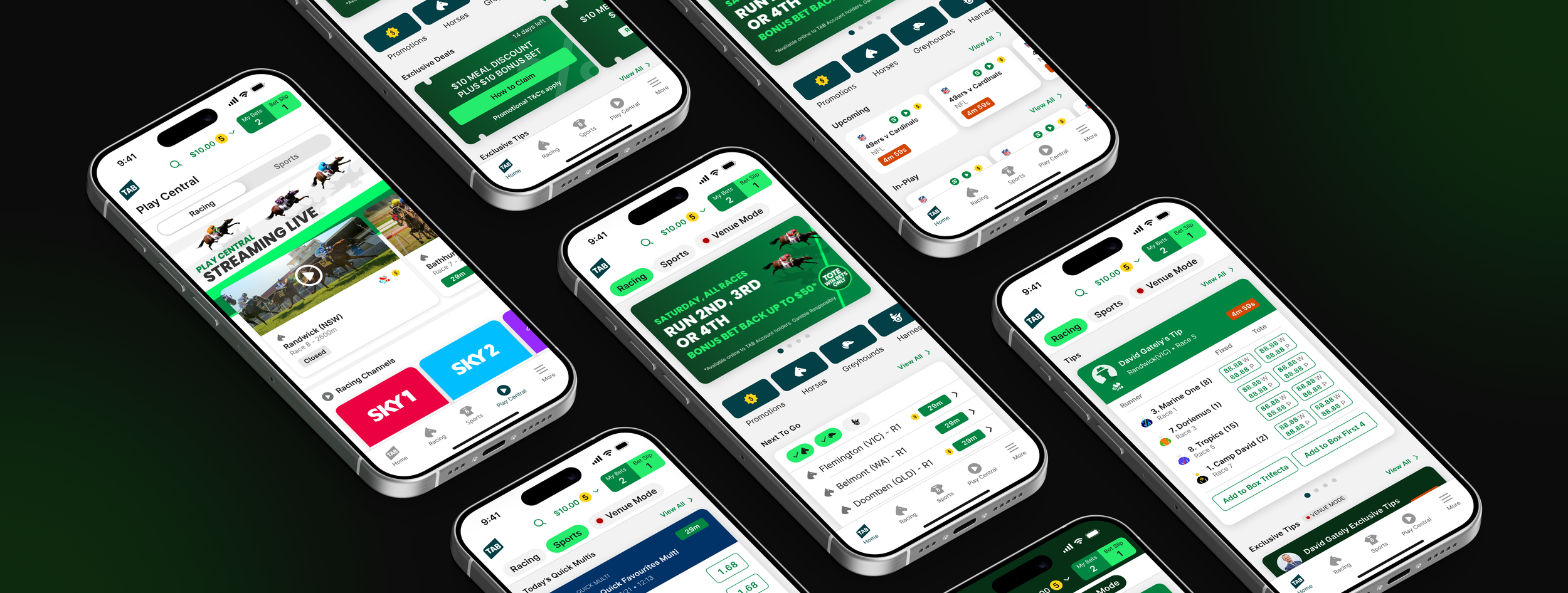
Icons, illustrations & animations
The custom app icons, illustrations, and animations play a crucial role in enhancing the overall user experience. Features such as QuickBet uses clear, easy-to-understand icons to simplify bet placement, allowing users to quickly place wagers with fewer taps. The Play Central feature, which provides live previews, lineups, and stats, incorporates sleek animations to update data in real-time, keeping users engaged without overwhelming them. Venue Mode, offering exclusive in-venue promotions, uses vibrant illustrations and subtle animations to highlight special deals and offers. These elements not only make the app visually appealing but also improve its usability by creating a smooth, responsive experience.
Design System
The Grass Design System provides consistency and efficiency across the user experience, ensuring clear interactions throughout the app. It was developed to native functionality on both iOS and Android platforms. It streamlines the design process by offering a cohesive set of components, styles, and guidelines, allowing for faster iteration and implementation of new features. With a unified visual language, users can easily navigate the app, making actions like placing bets or checking scores intuitive and straightforward. This consistency builds trust and reliability while enhancing brand recognition, ultimately creating a more engaging and efficient user experience that scales effortlessly across updates.


Accessible semantic colours
Accessible, semantic colours are essential for creating an inclusive user experience. They ensure that users with visual impairments or colour blindness can easily navigate the app and distinguish key elements, such as bet options, live updates, and important notifications. By adhering to contrast and accessibility standards, the app became more user-friendly, reducing frustration and increasing engagement for all users. Accessible colours also improve readability and clarity, especially in high-pressure moments like live betting, ensuring that everyone can participate and enjoy the experience without barriers.

TAB app commercial
Dynamic visuals and illustrations were crafted to capture the excitement of live sports and the new betting experience within the app. The storyboards visually mapped out the commercial step by step, focusing on key moments in the user journey, such as faster paths to markets, streamlined bet placement with QuickBet, updated previews, lineups, and stats in Play Central, and exclusive offers in Venue Mode. Bold, energetic colours, typography and clean iconography aligned the visuals with the brand’s style while enhancing emotional engagement. The storyboard showcased the app’s key features, creating a compelling narrative that resonated with sports enthusiasts.