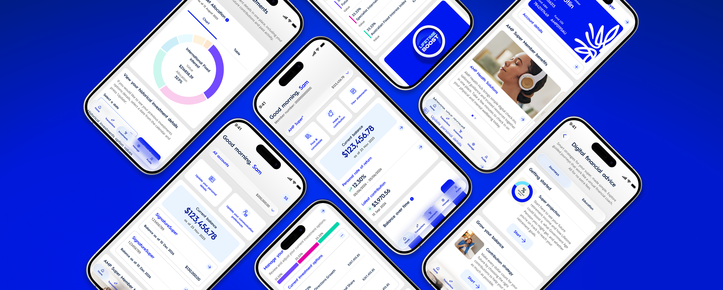
AMP Super, a connected digital superannuation and retirement experience
AMP is one of Australia's leading financial services organisations, helping Australians manage their superannuation, investments and retirement.
AMP Super was a major digital transformation initiative focused on creating a more personalised, accessible and connected superannuation and retirement experience.
The project brought together a dedicated native iOS and Android app and a responsive web portal, helping members manage their super, understand their investments, access personalised digital advice and plan for retirement.
As Lead UI Designer, I was responsible for end-to-end product design across key features and user journeys within the new native iOS and Android app, alongside leading its visual design direction.
My work covered the full design lifecycle, from exploring UX solutions and defining user flows, interaction design, high-fidelity UI, prototyping, developer handover and implementation QA. Alongside product delivery, I maintained and evolved the SuperMod design system, refining shared foundations, native component libraries and documentation. I also contributed to the responsive portal redesign through its component library, supporting consistency across the wider digital experience.
My focus was on simplifying complex financial experiences, strengthening visual consistency across platforms and supporting high-quality implementation through close collaboration with product, CX, engineering and QA teams.
Client
AMP
What was delivered
AMP Super Native iOS & Android App Experience
AMP Super Portal Experience
SuperMod Design System
The challenge: making superannuation simpler and more accessible
Understanding the problem: retirement confidence
Superannuation can be complex, with members navigating financial information, investment choices, contributions, insurance and retirement decisions across different stages of life.
AMP's existing My AMP platform provided broader account management capabilities. The opportunity was to create a more focused experience that addressed the specific needs of superannuation and retirement members, without replacing the existing platform.
We also examined the existing digital experience to understand opportunities to improve usability, navigation, information hierarchy and consistency.
The challenge was to translate complex financial services into an intuitive native experience while establishing a scalable visual language that could support ongoing product development across iOS and Android.
AMP's 2026 Retirement Confidence Pulse, based on a survey of 2,000 Australians, highlighted the uncertainty many people experience when planning for retirement.
These findings (↓) provided broader market context for the importance of accessible financial information, personalised guidance and retirement planning tools.
The opportunity was to help members better understand their superannuation, navigate financial decisions and access relevant services within a connected digital experience.
58%
worried their retirement savings would run out.
52%
felt financially confident about retirement.
75%
identified inflation and rising living costs as factors increasing their retirement concerns.
84%
aid having an income for life would make them more confident about spending in retirement.
Design challenges
Simplifying complexity
Present financial information and multi-step journeys in a way that feels clear, approachable and easy to understand.
Improving discoverability
Create intuitive navigation and entry points so members can easily find account information, important actions and self-service features.
Designing for native platforms
Deliver a consistent brand experience while respecting the interaction patterns and conventions of iOS and Android.
Building for scale
Establish reusable foundations and components that support multiple product features, accessibility requirements and efficient development.
Key Pain Points
Navigation & Discoverability
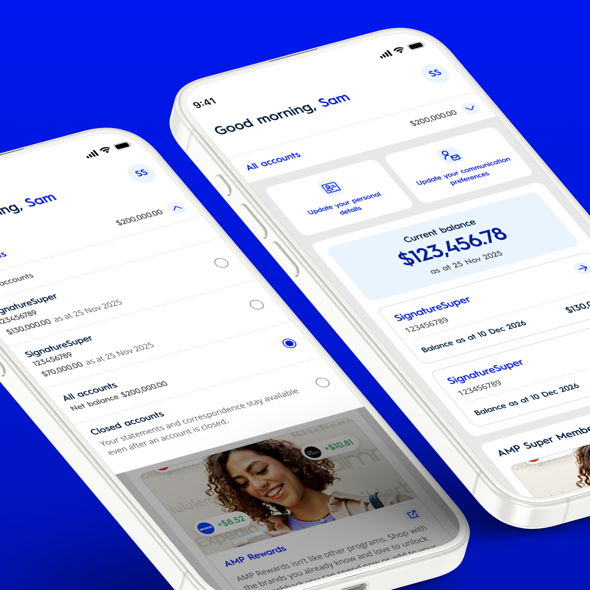
Problem: Important superannuation features were difficult to locate, creating unnecessary friction when accessing everyday account services.
Design solution
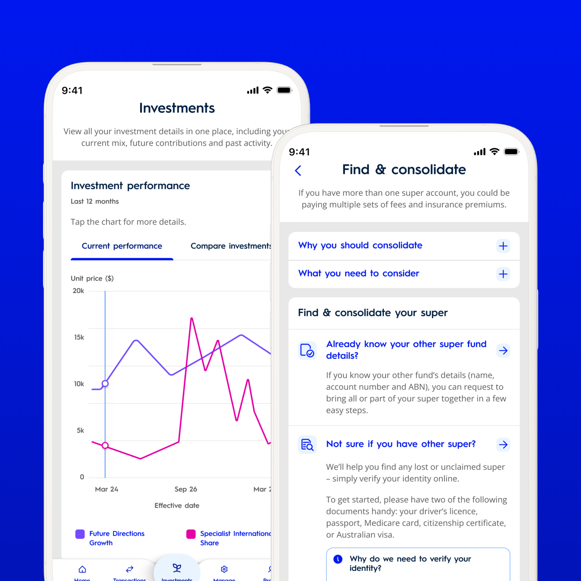
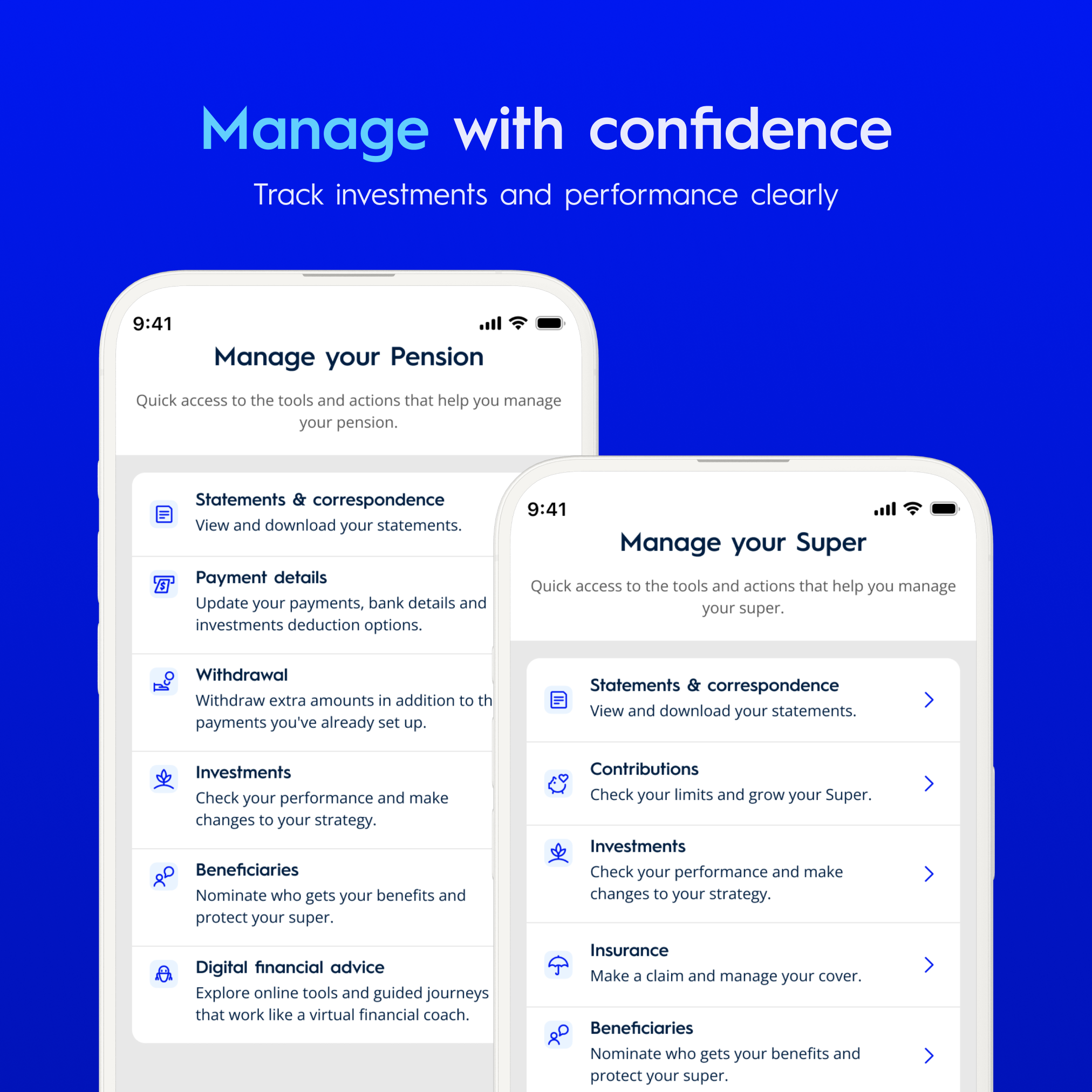
Clearer navigation, dashboard quick actions, account selection and a dedicated Manage menu.
Fragmented Account Information
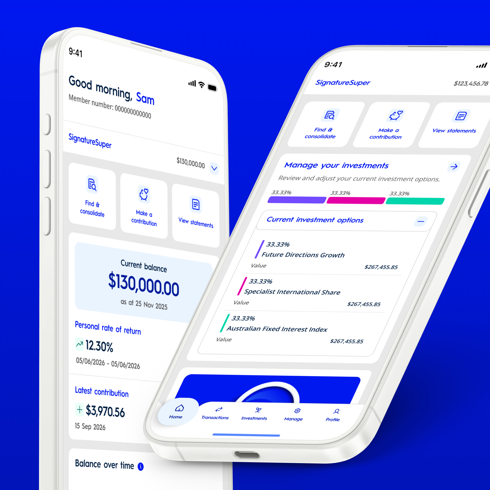
Problem: Members needed to understand balances, contributions, investments and insurance without navigating through multiple disconnected screens.
Design solution
Clear dashboard hierarchy and consolidated account information, making important details easier to access and understand.
Complex Self-Service Journeys
Problem: Superannuation tasks often involve unfamiliar terminology, multiple steps and important financial decisions.
Design solution
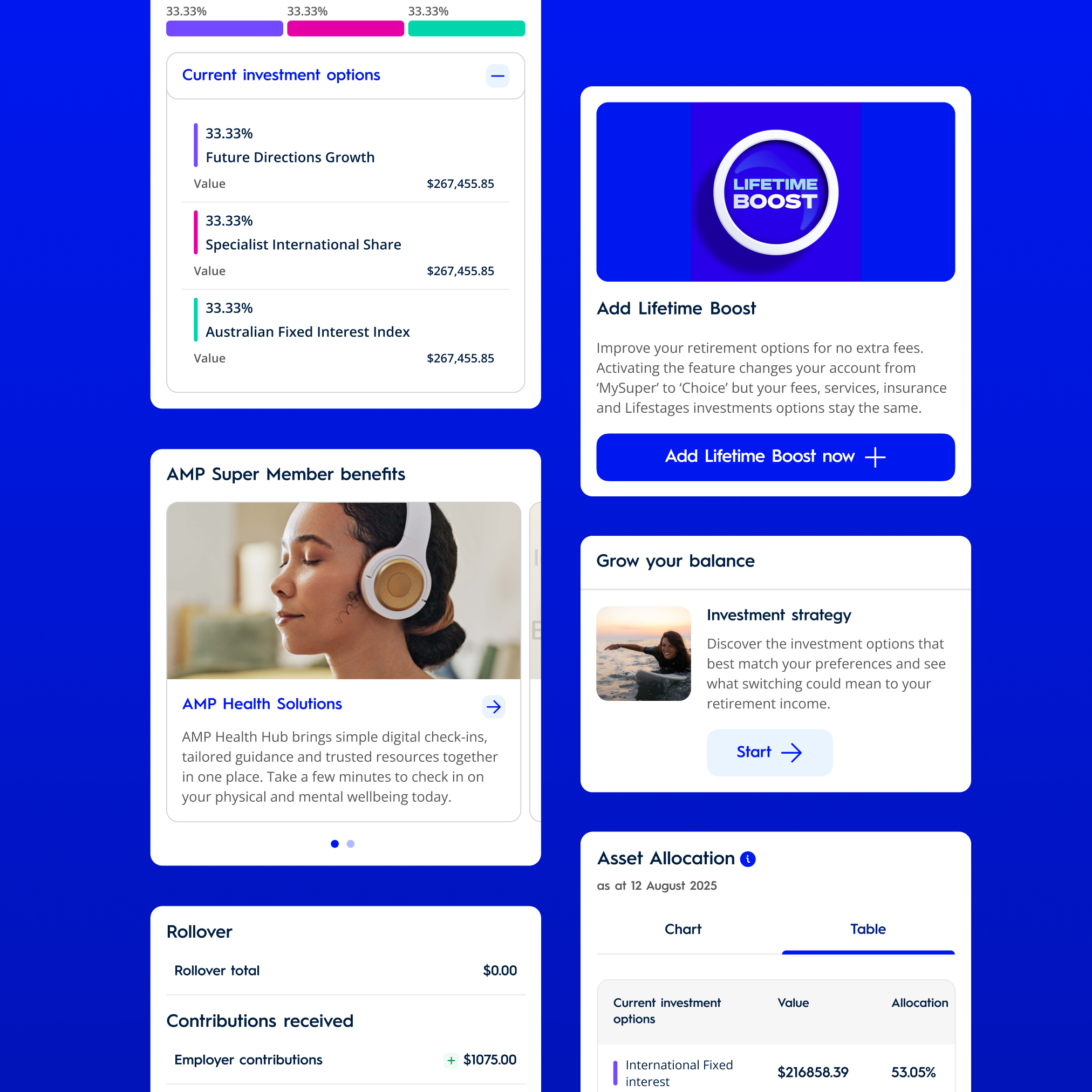
Clear instructions, progressive disclosure, consistent forms and meaningful feedback to guide members through complex processes. Eg.: Find & Consolidate Super, Withdrawals & investment management.
UI Consistency & Scalability
Problem: A large product with multiple journeys across two native platforms required predictable interactions and reusable design patterns.
Design solution
Shared design foundations, reusable components, consistent interaction states and native platform documentation.
Research, discovery and usability insights
My role was to work with the findings and business requirements, identify opportunities within the product experience and translate them into practical UX and UI solutions.
The design process considered existing My AMP journeys, navigation patterns, content complexity, accessibility requirements and technical constraints.
Contribution history discoverability
Usability testing: 6 of 8 participants struggled to locate their contribution history.
Design response: Improve the visibility of contributions through clearer dashboard entry points, more intuitive labels and consistent transaction navigation.
Customer support discoverability
Support analysis: 28% of sampled enquiries related to difficulty finding relevant information or support pathways.
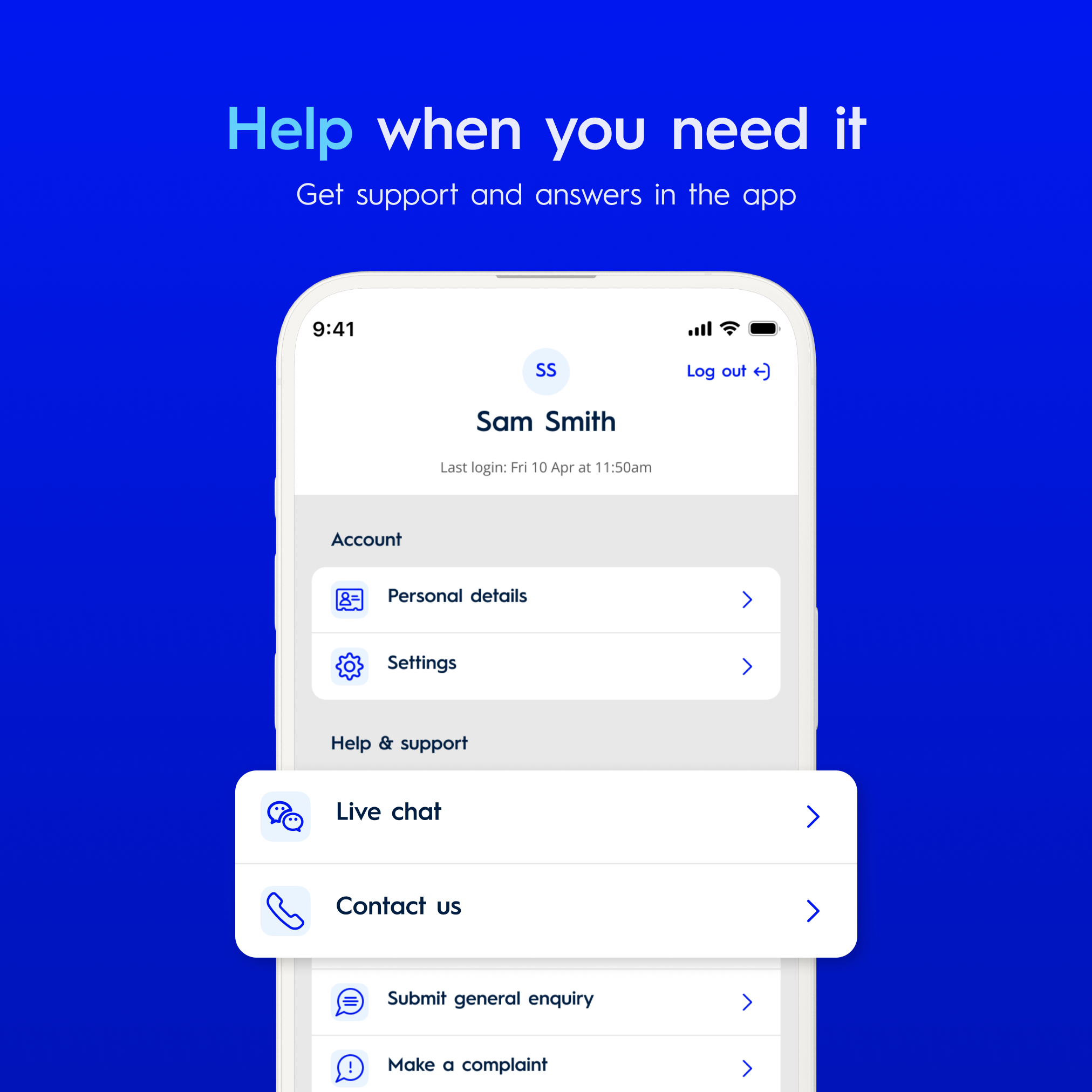
Design response: Improve help and support navigation, introduce contextual assistance and simplify terminology.
Investment information
Usability testing: 7 of 10 participants overlooked investment information.
Design response: Improve the visual hierarchy of investment information and provide more prominent entry points to investment details.
Accessibility insights
Accessibility testing: Screen reader reviews identified controls with missing or unclear accessibility labels and content announced in an incorrect reading order.
Design response: Improve accessibility labels, reading order, interaction feedback and component specifications to support clearer screen reader navigation and behaviour.
End-to-End Product Design
My role extended across the full product design lifecycle, from understanding business requirements and customer needs to exploring UX solutions, defining user flows, creating interactive prototypes and delivering high-fidelity native UI.
Working closely with product owners, CX designers and engineers, I translated complex superannuation requirements into intuitive, accessible experiences across iOS and Android.
I remained involved throughout development, supporting engineering handover, reviewing implementation and refining the experience through QA.
Evolving the SuperMod Design System
Alongside product delivery, I was responsible for maintaining and evolving the SuperMod design system. My focus was on improving the foundations, refining components, extending the libraries and strengthening documentation to support consistent and scalable product development.
Foundation uplift
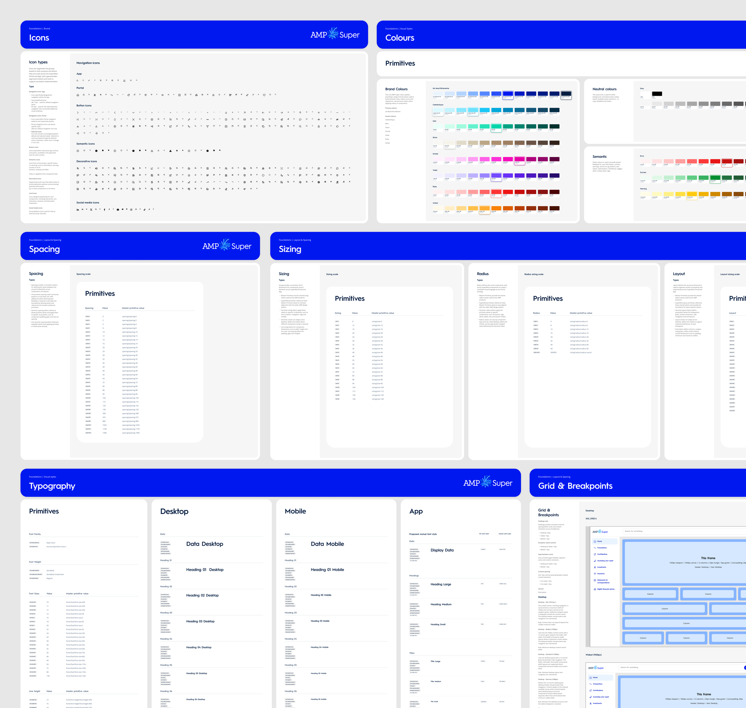
I refined the shared design system foundations, including semantic colour tokens, typography, spacing, sizing, border radius, iconography and layout principles. The uplift focused on improving consistency, accessibility and scalability across native iOS, Android and responsive web, establishing a more structured foundation for reusable components and future development.
Native iOS and Android component libraries
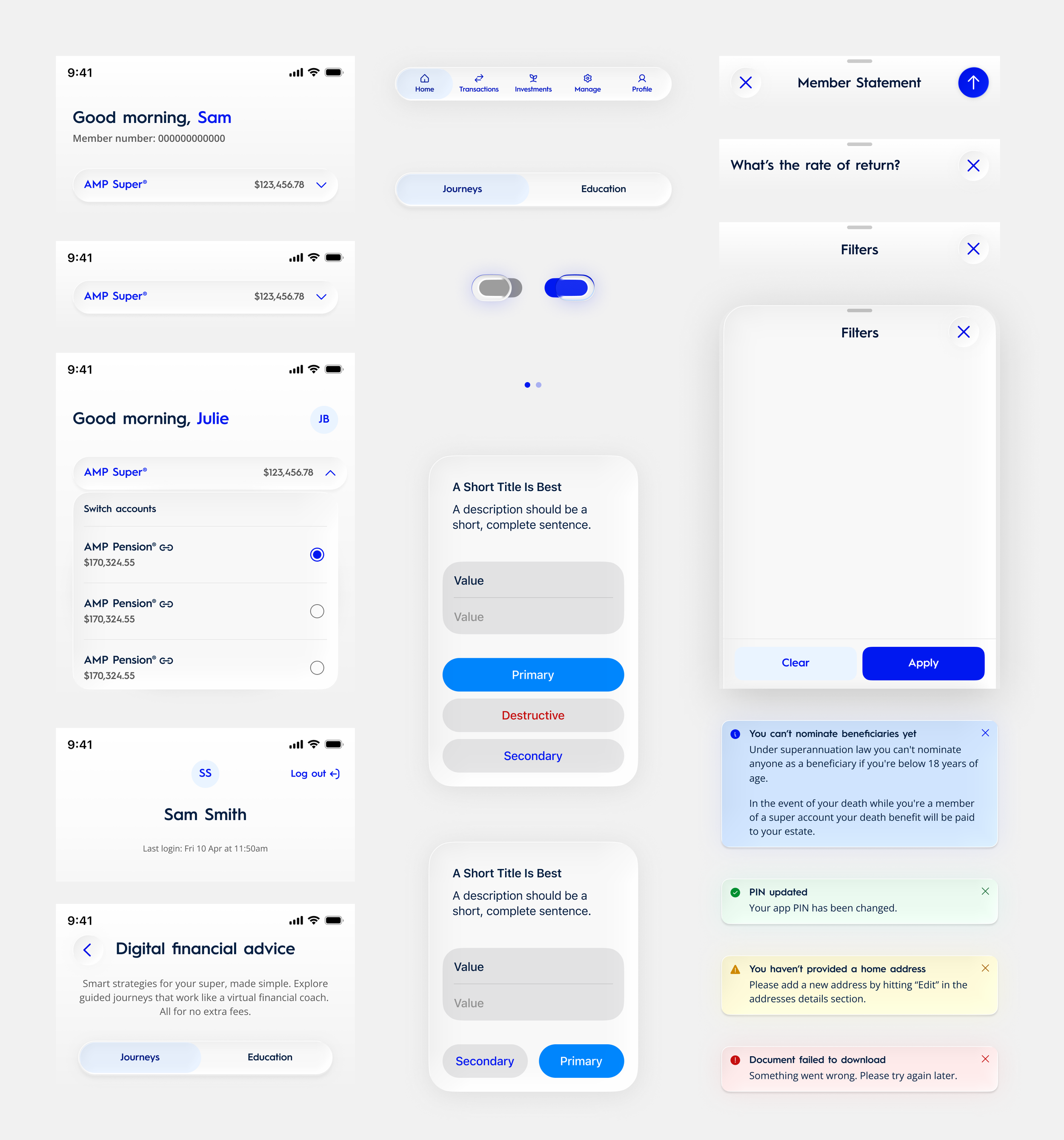
I maintained and enhanced the native app component libraries, refining variants, properties, states and interaction behaviours. Components included navigation, buttons, cards, forms, lists, dialogs, sheets, notifications, feedback patterns and other common interface elements. The libraries supported consistent implementation while accommodating platform-specific behaviour.
Native platform conventions
For iOS, I worked with native patterns including navigation bars, toolbars, sheets, alerts, system feedback and iOS 26 Liquid Glass considerations.
For Android, the component library aligned with Material 3 principles and native interaction patterns.
The objective was to create a cohesive AMP visual experience without forcing identical interactions across different operating systems.
Documentation and governance
I maintained and expanded documentation covering foundations, component behaviour, usage guidelines, accessibility and native system patterns. This supported clearer handover, implementation consistency and ongoing design system maintenance.
Key Features & Design Solutions
Dashboards & Navigation
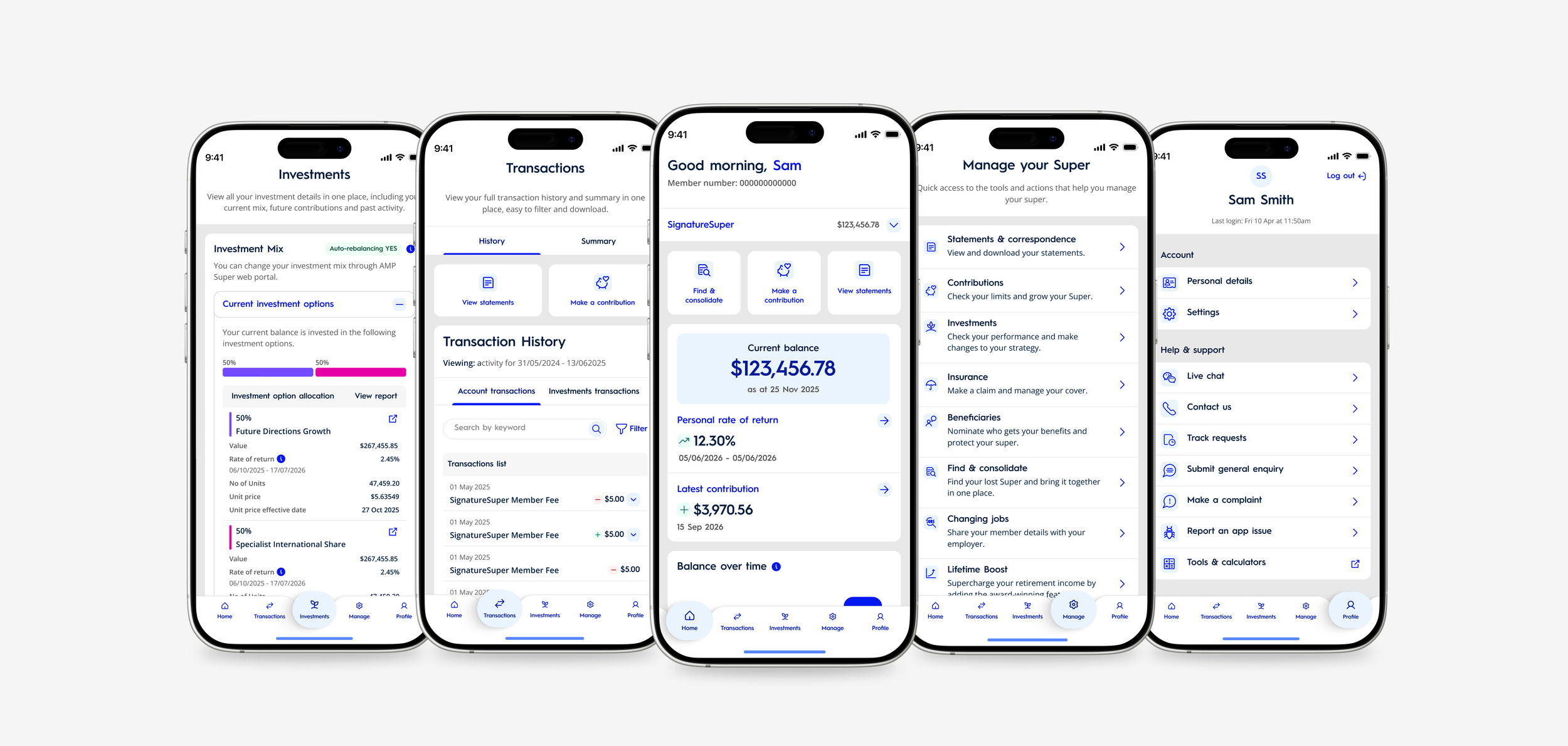
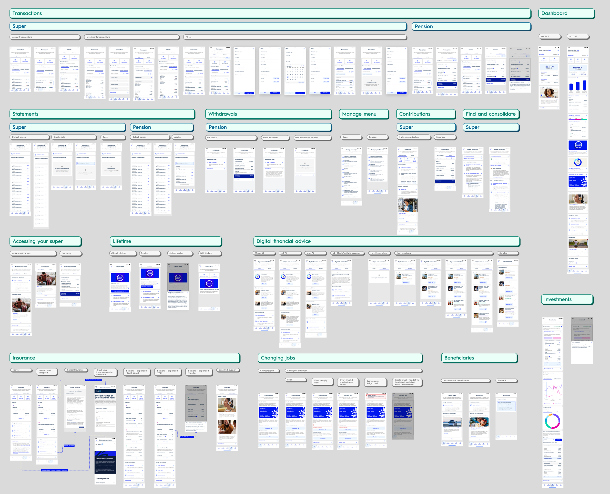
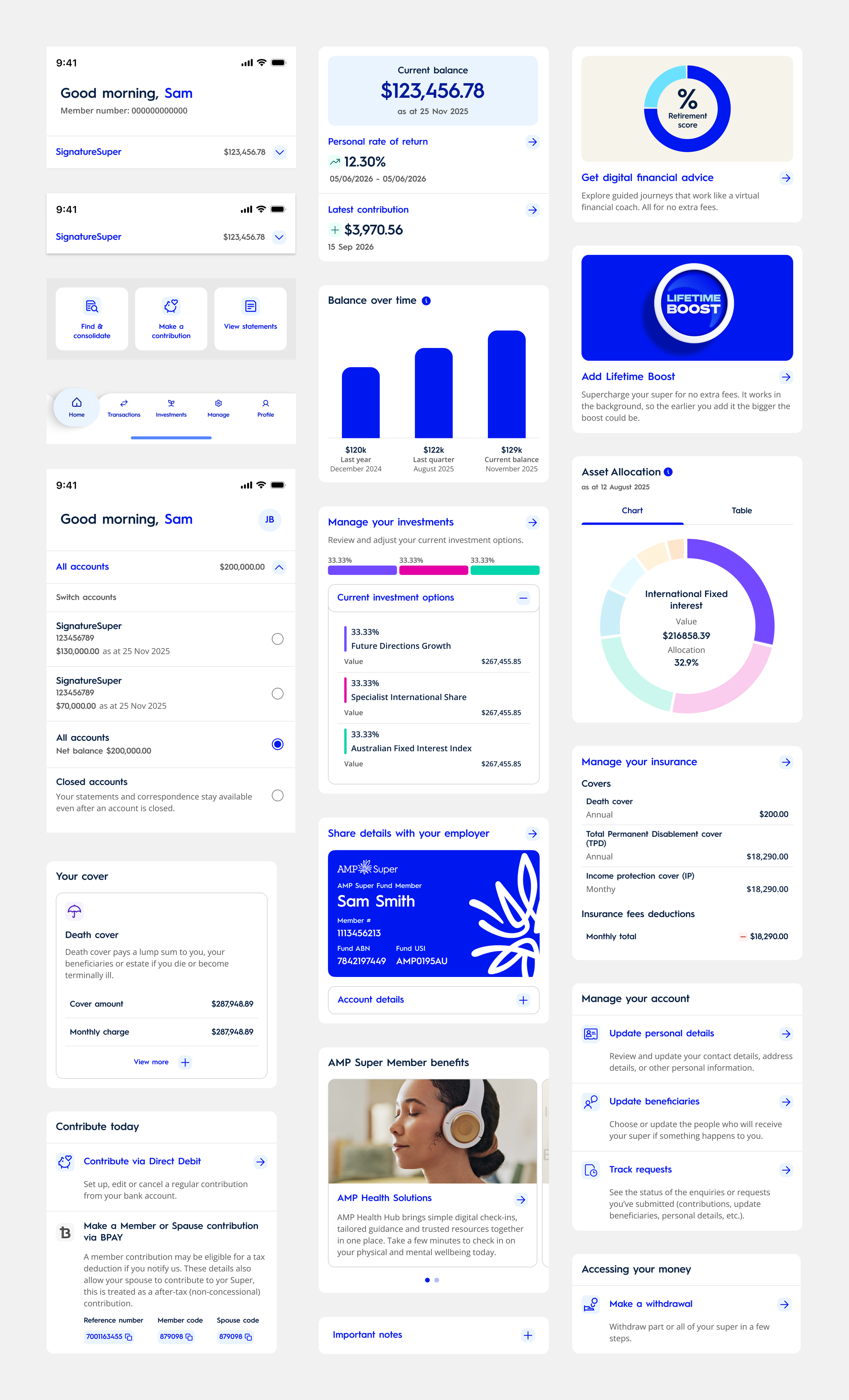
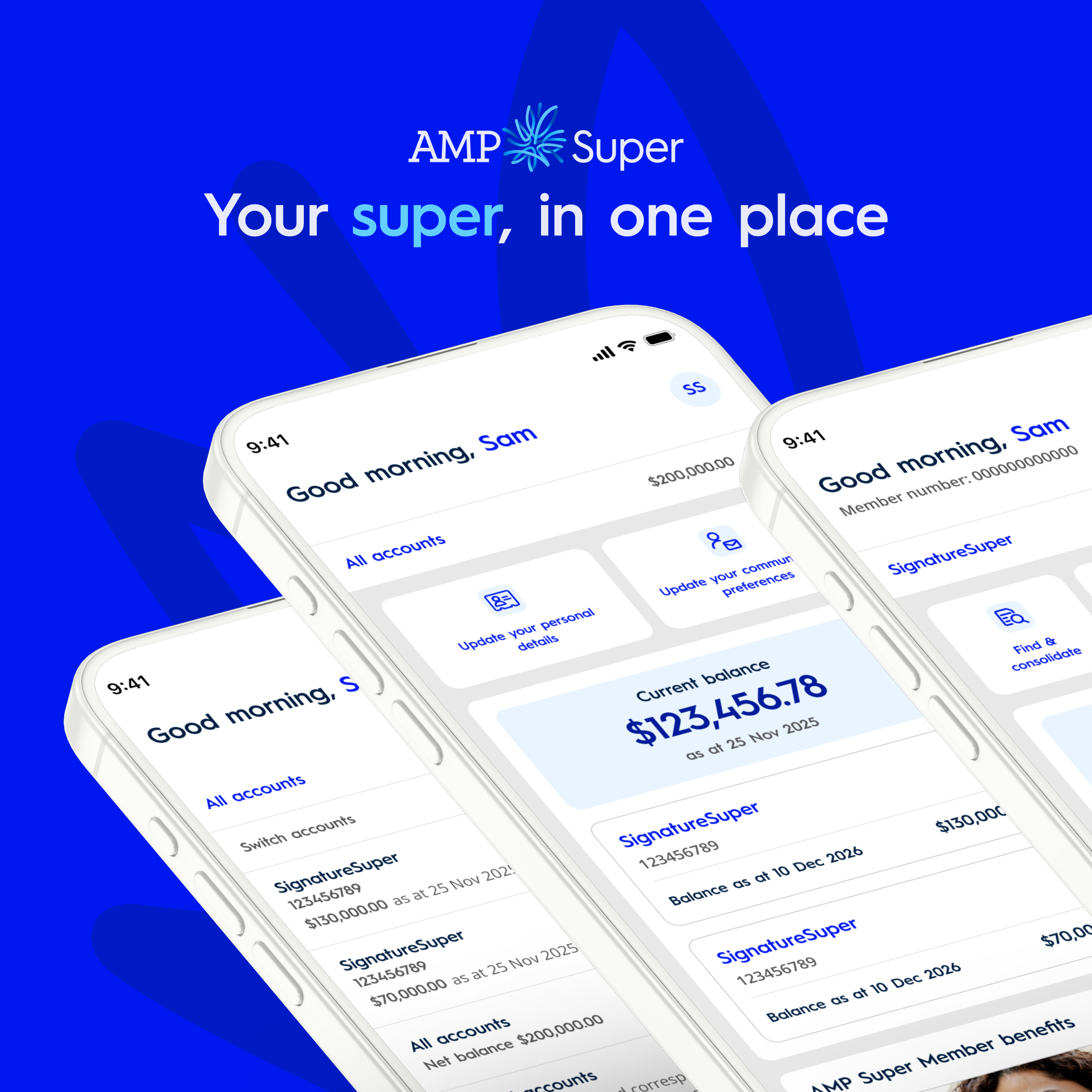
Designed the General Dashboard and account-level dashboard to bring together balances, investments, contributions and important account information.
→ Clear information hierarchy, modular cards, dashboard quick actions and a dedicated Manage menu helped simplify navigation and improve feature discoverability.
Contributions, Transactions & Statements
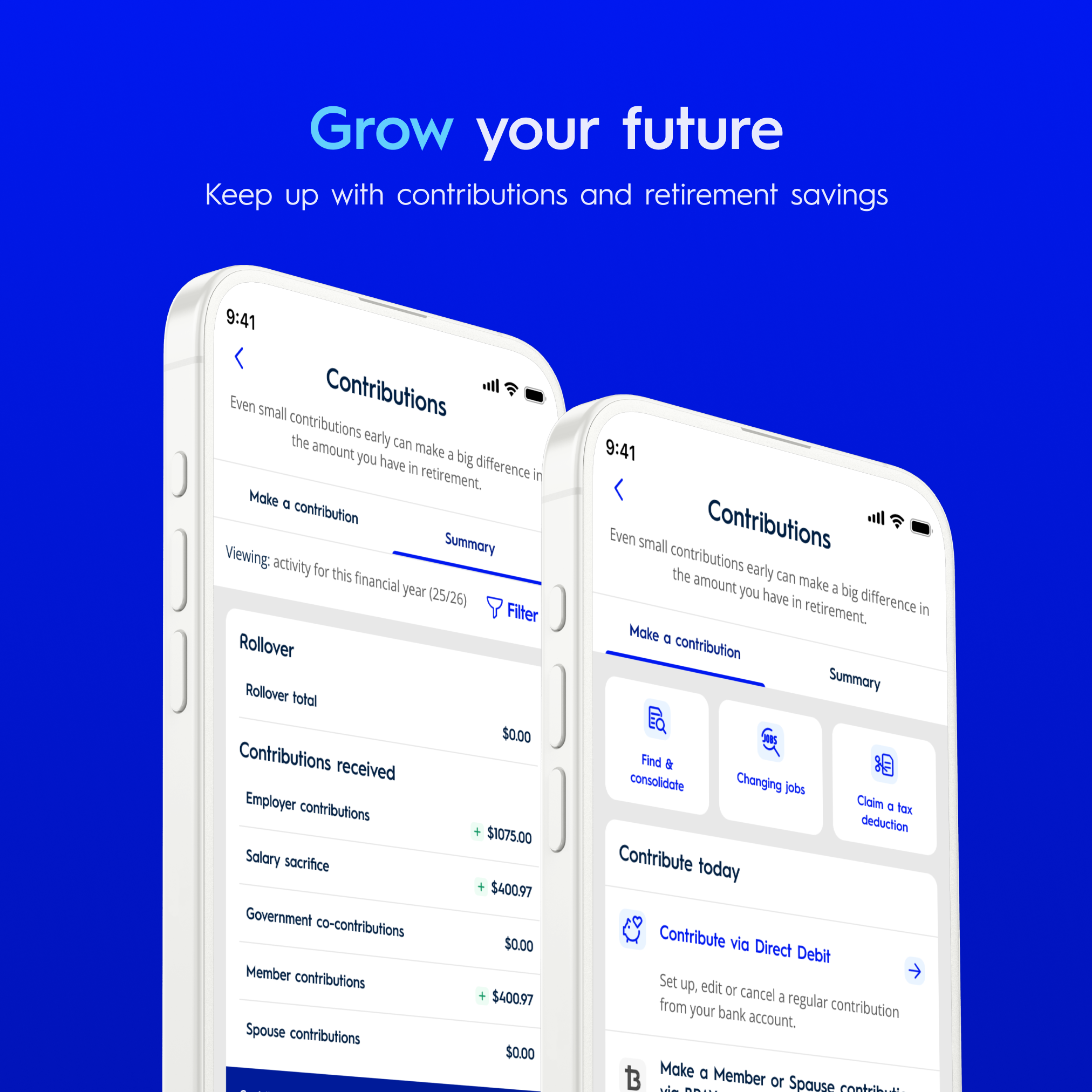
Designed consistent experiences for reviewing contributions, transaction history, statements and correspondence.
→ Structured lists, clear labels, filters and intuitive entry points helped members find and understand their financial information.
Investments & Retirement
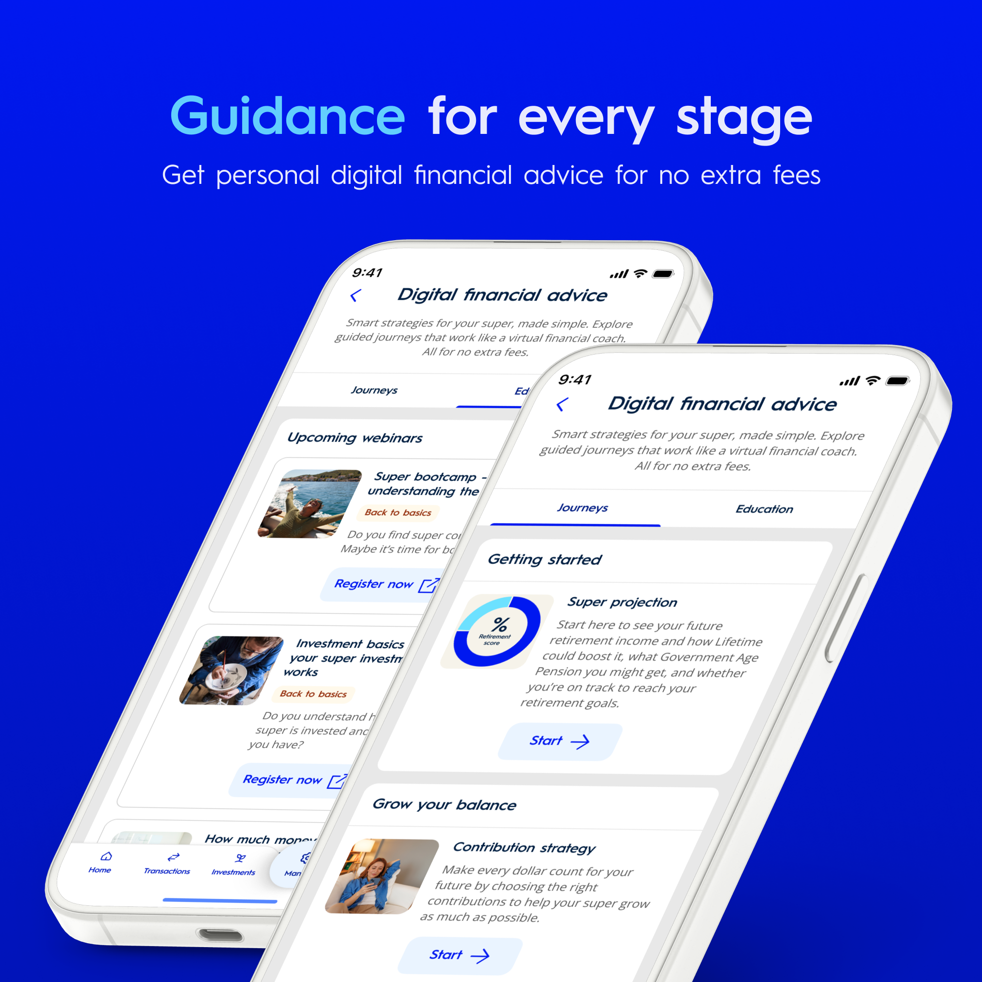
Designed investment management experiences using clear information hierarchy, data visualisation and guided interactions to help members understand their portfolios and explore available options.
→ The broader app also supported retirement planning, personalised digital advice and pension services.
Self-Service & Account Management
Designed guided journeys for Find & Consolidate Super, withdrawals, insurance and account management.
→ Clear instructions, progressive disclosure, consistent form patterns, validation and meaningful feedback helped simplify complex financial tasks.
-
![]()
Unified account overview and personalised dashboard experience
-
![]()
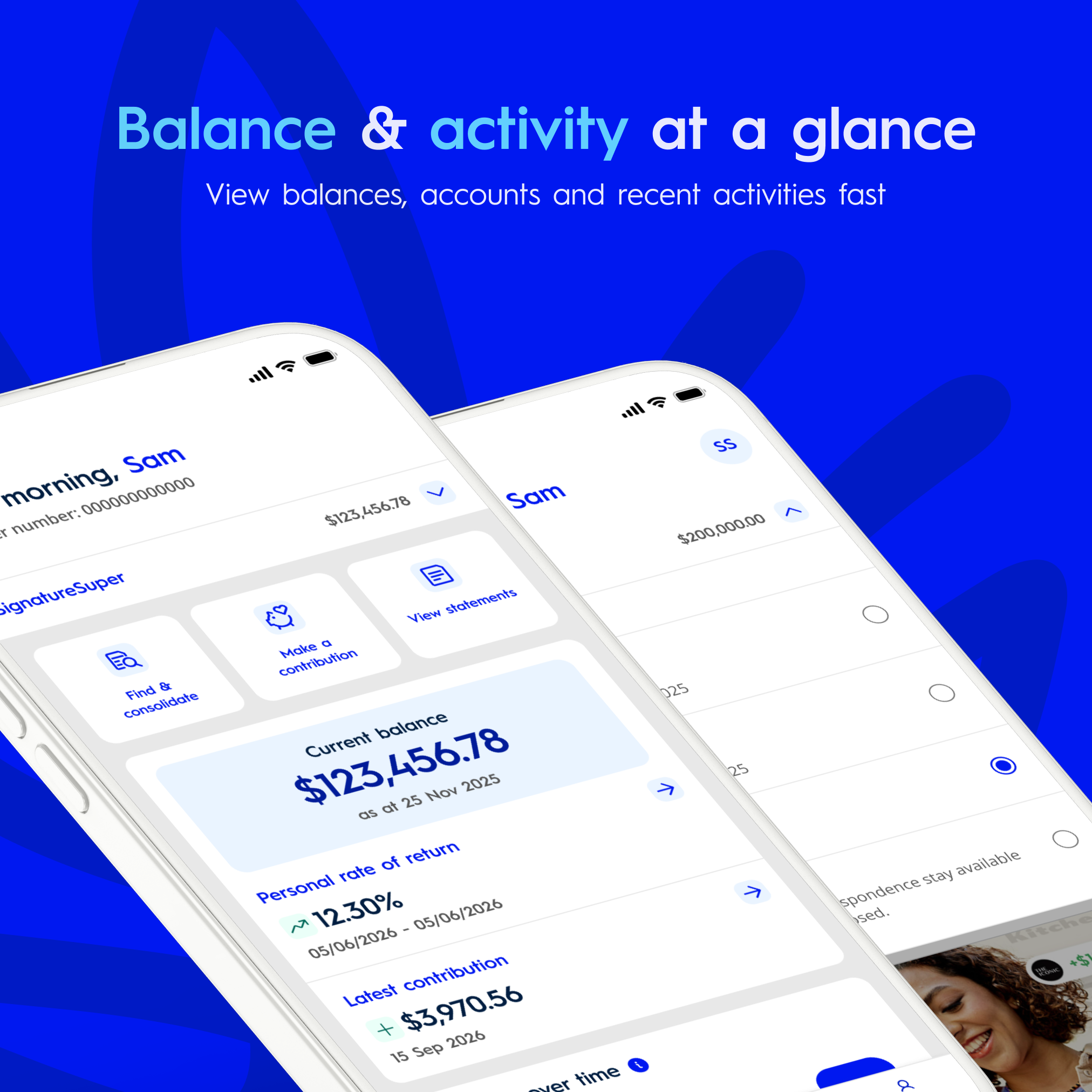
Clear visibility of balances, performance and recent activity
-
![]()
Streamlined access to investments, insurance and account management
-
![]()
Simplified contribution tracking and ways to grow retirement savings
-
![]()
Personalised digital financial advice and retirement planning journeys
-
![]()
Integrated support, live chat and accessible help options
Collaboration, Implementation & Future Innovation
Close collaboration with engineering was essential throughout product delivery and design system evolution. I worked closely with iOS and Android developers to clarify component behaviour, review technical constraints and ensure design consistency during implementation.
My involvement extended through developer handover, native build reviews, accessibility testing and QA, helping identify and resolve UI inconsistencies across platforms.
Figma Extended Collections
Explored improved organisation and management of variables, themes and design system foundations.
Code Connect
Explored mapping Figma components to production code to provide more accurate implementation references.
Improving Design-to-Development Workflows
As part of my design system responsibilities, I developed an improvement roadmap exploring opportunities to strengthen design-to-development alignment and introduce AI-assisted workflows.
The roadmap prioritised strengthening foundations and aligning design with engineering before introducing AI-assisted workflows.
These technologies were explored as future opportunities, rather than all being deployed into production.
Model Context Protocol (MCP)
Explored how AI tools could access structured design system information, including components, tokens and documentation.
Figma Make Kit
Explored AI-assisted prototyping using existing design system components and styles.
Impact and outcomes
300 defects tracked
Around 300 defects were recorded during the QA process, with 22 remaining in the July 2026 project snapshot.
93% resolved
Based on that snapshot, approximately 278 of 300 tracked defects were no longer outstanding, subject to confirmation that the figures represent the same defect population.
100% first pass
The iOS and Android component libraries completed first-pass QA coverage.
24.5K downloads
Since launching in September 2026, the app has recorded 17.8K iOS downloads and 6.7K Android downloads over a 40-day period.
Quality and delivery metrics