Embracing heritage, celebrating football
I had the incredible opportunity to develop a complete brand identity concept for the 2010 FIFA World Cup in South Africa as part of my thesis project.
To truly capture the essence of South Africa, I traveled there and spent time immersing myself in its culture, studying its art, patterns, and storytelling traditions in Johannesburg. That research became the foundation of my design approach, ensuring that every element of the identity felt authentic and deeply rooted in the country’s spirit.
Sport event
FIFA World Cup South Africa 2010
Project type
Research
Visual concept
What was delivered
Brand Identity

I began by immersing myself in South Africa’s diverse cultures, history, landscapes, and traditions. Understanding the spirit of the nation was crucial—this was the first World Cup held on African soil, and it needed to authentically celebrate South Africa’s rich identity. I studied tribal patterns, local art styles, traditional textiles, wildlife, and historical symbols, ensuring every visual choice was informed and meaningful.
Research
The central idea was to blend the universal passion for football with the unique rhythm and vibrancy of South Africa. I explored multiple concepts focusing on energy, unity, and celebration. Sketching played a huge role during this phase—I worked by hand to create dynamic poses of a footballer in action, stylised in a way that echoed African brushstroke art and mural traditions.
Concept development
The central motif of the design is inspired by traditional African masks, which hold deep cultural significance across the continent. These masks symbolise heritage, identity, and the shared history of storytelling through art. I incorporated three masks to represent diversity, unity, and the collective passion that football ignites worldwide.
To tie the design back to the sport itself, I subtly integrated football patterns within the masks, blending tradition with modernity. The colour palette—rich earthy browns, deep golds, and warm ochres—reflects the vibrancy of South Africa, from its landscapes to its people. Against a bold black background, the design feels striking much like the energy of the tournament itself.
The fusion of culture and football, the Logo

Artistic expression, system and application design

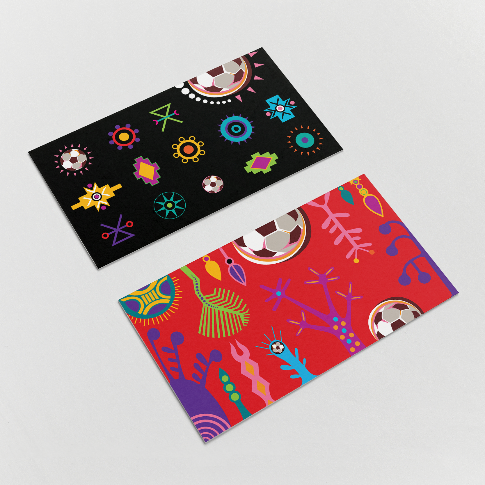


Beyond the logo, I designed a flexible visual system that extended to event posters, tickets, signage, merchandise, digital platforms, and broadcast materials. Patterns inspired by traditional Ndebele house paintings and motifs created a consistent yet lively backdrop across brand touchpoints. Icons, textures, and secondary graphics all worked together to tell a cohesive story of African pride and global celebration.


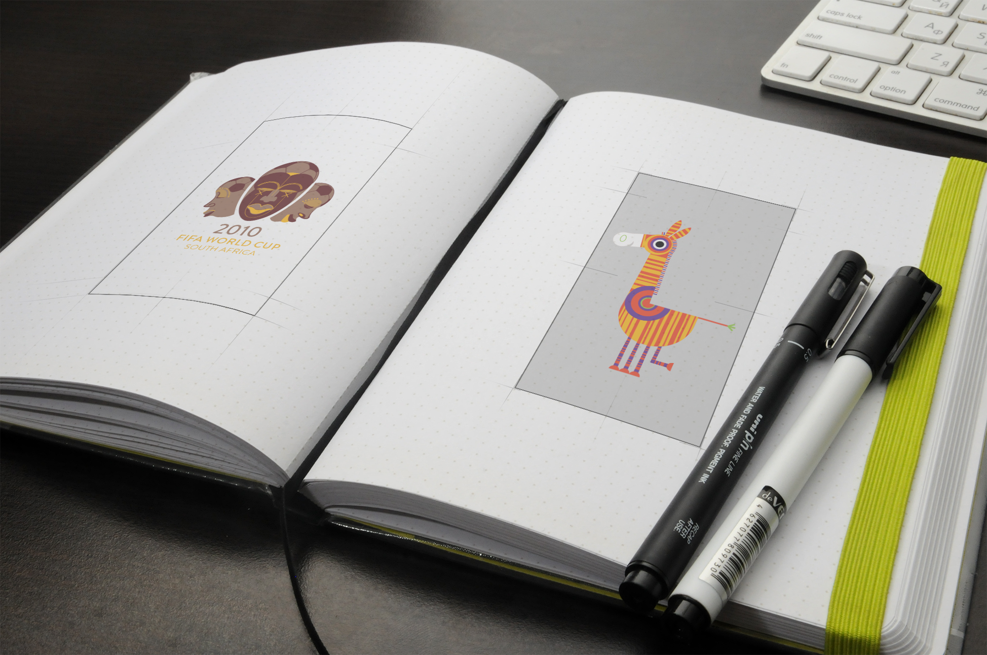
The mascot, a bold and charismatic zebra, was designed to embody the spirit and vibrancy of South Africa. With playful expressions and dynamic poses, the character brought a sense of humour, likeability, and engagement to the brand experience.
In addition to the main mascot, the brand identity included a vibrant character ecosystem designed to bring South Africa’s natural beauty and energy to life. Four distinct character sets were created to form a rich visual narrative:
Mascot and characters

African animals: Playful and expressive illustrations of native wildlife.


Soccer players: Dynamic figures in action, rendered with bold lines and vibrant energy.

Flora and fauna: A series of stylized plants, trees, and flowers native to South Africa added a layer of authenticity and environmental storytelling.


Abstract minimal forms: Geometric shapes and colourful patterns, inspired by traditional African motifs, added rhythm, vibrancy, and a contemporary visual texture to the brand system.
Custom alphabet
The custom abstract alphabet reflects the spirit of South Africa and the dynamic energy of the tournament. The letterform were inspired by traditional African art—featuring bold geometric shapes, rhythmic patterns, and curves that echoed colourful murals. The alphabet balanced abstraction and legibility, creating a distinctive visual language that felt both expressive and modern. This custom typography brought a cohesive voice across all touchpoints from stadium signage to merchandise.


Vibrant colour palette
The core palette draws inspiration from two powerful sources:
1. The South African flag featuring red, blue, green, yellow, black, and white, the flag symbolises unity in diversity.
2. The Ndebele house colour palette
To infuse local cultural richness, I incorporated the bold and geometrically structured color system of traditional Ndebele mural art. This added expressive layers of symbolism, with bright reds, blues, yellows, greens, and strong black-and-white contrasts.
